
I sat down and studied Cincinnati’s yearly budget and used some insights to generate a few different aesthetic directions for the RC! website. Here are a few splash page ideas.
Some thoughts so far:
• This might be too much info on one page. These insights could be broken into multiple pages going forward.
• These could be pushed in more playful directions. Visually, text-wise, etc.
• These need to be more cognizant of ‘above-the-fold’ (web) design thinking.
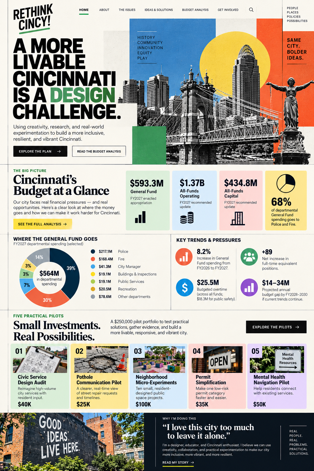
Academic version
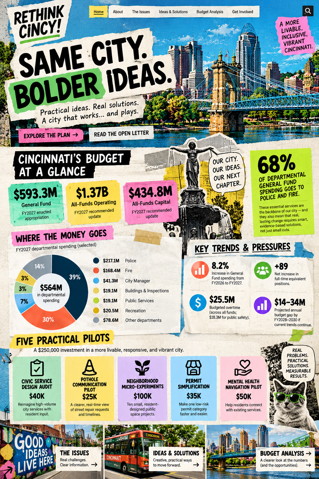
Funky version
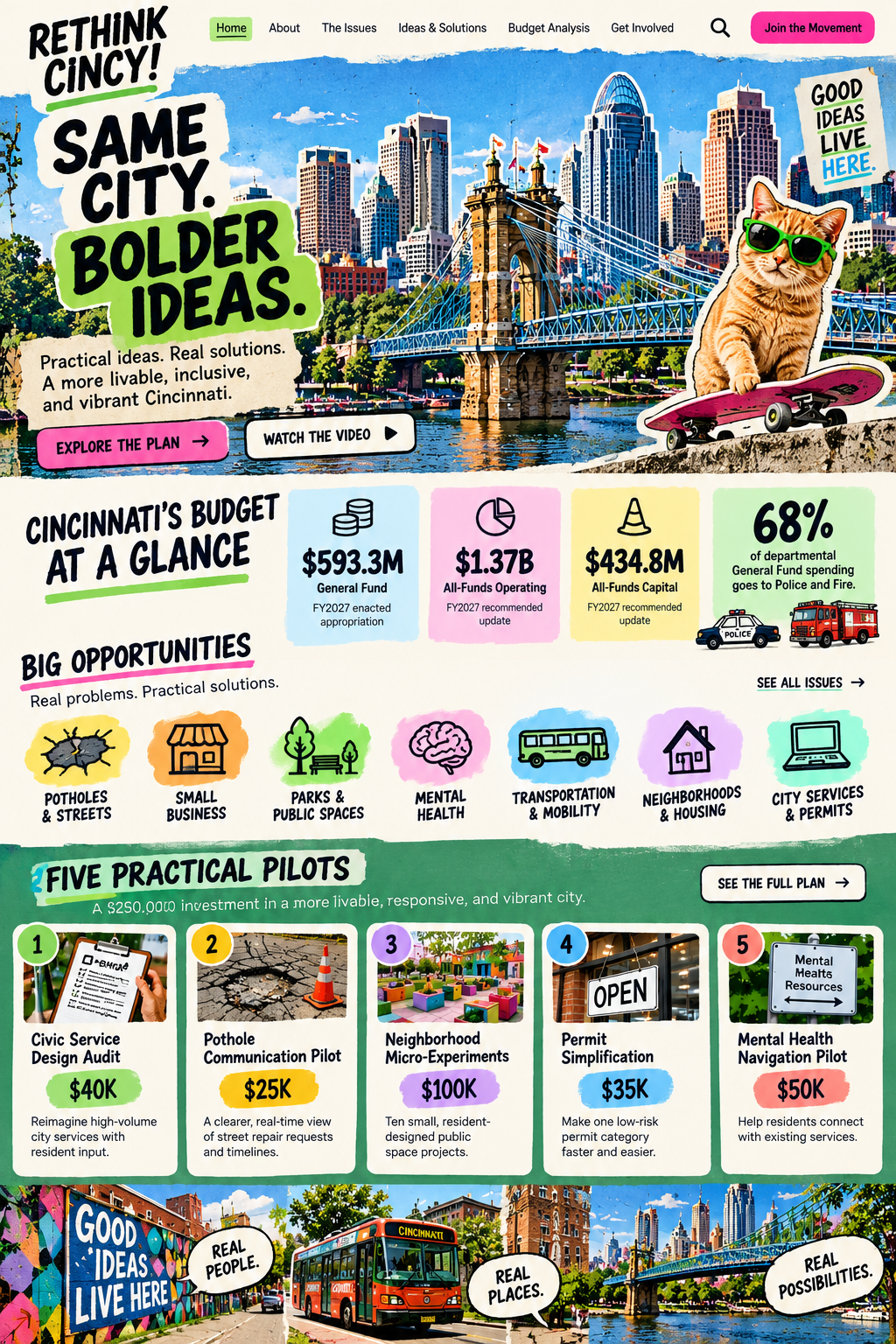
Playful version
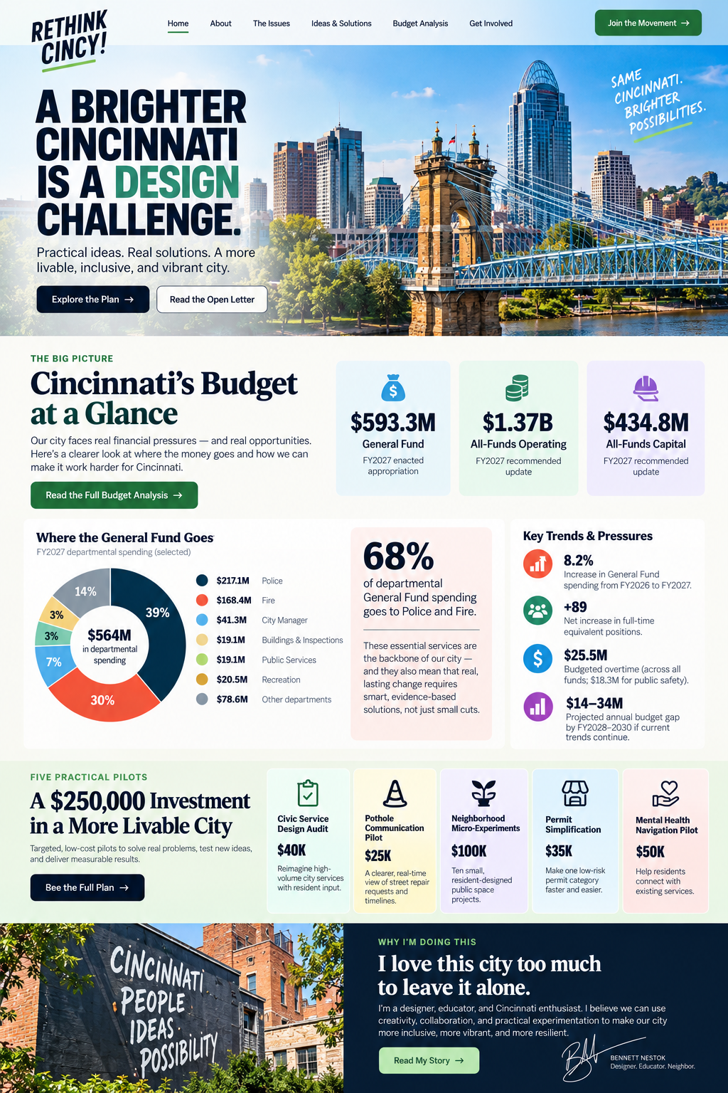
Crisp version